


Introduction
A risk heat map (or risk heatmap) is a visual risk assessment tool that displays an organisation's risks on a color-coded grid, plotting each risk according to its likelihood of occurrence (on one axis) and the severity of its potential impact (on the other). Green cells indicate low risk, amber indicates moderate risk, and red indicates high risk. Risk heat maps give leadership an at-a-glance view of risk portfolio status and are widely used in board reporting and risk committee presentations.
Risk is not a background condition for modern organizations — it is an active, measurable force shaping strategic decisions at every level. Aon's 2025 Global Risk Management Survey, drawing on responses from nearly 3,000 risk managers, C-suite leaders, and executives across 63 countries, found that cyber attack, climate change, and geopolitical volatility now occupy the top ranks of global risk concern. The gap between risk awareness and risk measurement is precisely where tools like the risk heat map deliver the most value: by translating complex, multi-source risk data into a visual format that any stakeholder can read, act on, and communicate in minutes.
That’s why many choose a tool like MetricStream. Its platform gathers risk data from across the organisation and turns it into interactive heatmaps that highlight key exposures at a glance. Teams can see where risks cluster, what’s changing, and where to act first — helping them stay ahead, not just react.
With effective heatmaps, organisations avoid surprises and stay prepared. They make it easier for leaders to see risk at scale, talk about it clearly, and match resources to what matters most.
Key Takeaways
A risk heat map is one of the most widely used tools in enterprise risk management, but its value depends on how well it is built, maintained, and connected to decision-making. The points below summarize what it is, how it works, and what organizations need to get right to use it effectively. The following points summarize what a risk heat map is, how it works, and why it matters for risk-led organizations:
- A risk heat map is a visual tool that represents the likelihood and impact of various risks on a color-coded grid, helping organizations prioritize and manage potential threats effectively.
- Purpose of Risk Heat Maps: Visual tools to prioritize and manage risks based on their likelihood and impact.
- Creation Process: Identify and assess risks, assign scores for likelihood and impact, plot on a grid, use color-coding for severity, and develop mitigation strategies.
- Key Benefits: Enhanced visualization, improved stakeholder communication, proactive risk management, increased organizational risk awareness, and strengthened analytical capabilities.
- Importance of Regular Updates: Regular reviews and updates ensure the heat map remains an accurate and effective tool.
What is a Risk Heat Map?
A risk heat map is a visual tool that organizes risks based on their likelihood and impact, allowing teams to understand exposure at a glance. It brings together data from assessments, controls, and incidents to present a clear view of where risks concentrate and which areas need attention. By translating risk levels into a simple color-coded grid, it helps leaders prioritise actions and make informed decisions.
The standard 5×5 heat map below illustrates how likelihood and impact scores combine to produce color-coded risk zones across 25 cells:
| Likelihood ↓ / Impact → | Negligible (1) | Minor (2) | Moderate (3) | Major (4) | Catastrophic (5) |
| Almost Certain (5) | 5 🟡 | 10 🟡 | 15 🔴 | 20 🔴 | 25 🔴 |
| Likely (4) | 4 🟢 | 8 🟡 | 12 🟡 | 16 🔴 | 20 🔴 |
| Possible (3) | 3 🟢 | 6 🟢 | 9 🟡 | 12 🟡 | 15 🔴 |
| Unlikely (2) | 2 🟢 | 4 🟢 | 6 🟢 | 8 🟡 | 10 🟡 |
| Rare (1) | 1 🟢 | 2 🟢 | 3 🟢 | 4 🟢 | 5 🟡 |
🟢 Low (1–6): Monitor routinely | 🟡 Medium (7–12): Manage actively | 🔴 High (13–25): Priority action required
Components of a Risk Heat Map
Central to the effectiveness of a risk heat map are its two primary axes, one representing the likelihood or probability of a risk occurring, and the other showcasing the impact or severity of consequences should the risk materialize. This two-dimensional framework allows for a nuanced analysis of risks, categorizing them by both, their potential to happen, and also by the magnitude of their possible effects on the organization.
Adding a layer of intuitive understanding to this framework, color coding enhances the heat map’s accuracy.
Traditionally, this involves employing a color gradient – typically red, yellow, and green – to signify the severity of risks. Risks mapped in red zones are indicative of critical threats that demand immediate attention due to their high probability and significant impact.
Yellow, on the other hand, signals moderate risks that warrant caution but may not require urgent action. Green areas are associated with low-priority risks, either due to their low likelihood, minimal impact, or both.
This color-coded system simplifies complex risk assessments, allowing stakeholders to quickly grasp and navigate the situation.
Risk Heat Map Components
| Component | Description | Design Consideration |
| Y-Axis (Likelihood) | Represents the probability that each risk will occur within the assessment period | Use clearly defined descriptors at each level: Rare, Unlikely, Possible, Likely, Almost Certain — with criteria specifying what each level means in organizational context |
| X-Axis (Impact) | Represents the severity of consequences if the risk materializes | Define impact separately across financial, operational, compliance, and reputational dimensions to prevent assessors from conflating different consequence types |
| Color Zones | Visual classification of risk severity across the grid | Calibrate zone boundaries to the organization's risk appetite rather than applying generic thresholds; what is red for one organization may be amber for another with a higher risk tolerance |
| Risk Points | Individual risks plotted at their likelihood-impact intersection | Display a risk ID and brief name at each point; each point should link through to the full risk register entry for drill-down context |
| Legend | Defines what each color zone means and what action is required | Always include; specify not just the color label but the expected management response for each zone so the map is self-explanatory to any reader |
| Risk Trajectory Arrows | Directional indicators showing whether each risk is increasing, decreasing, or stable since the last review | Include where the platform supports it; trajectories add significant analytical value by showing momentum, not just current position |
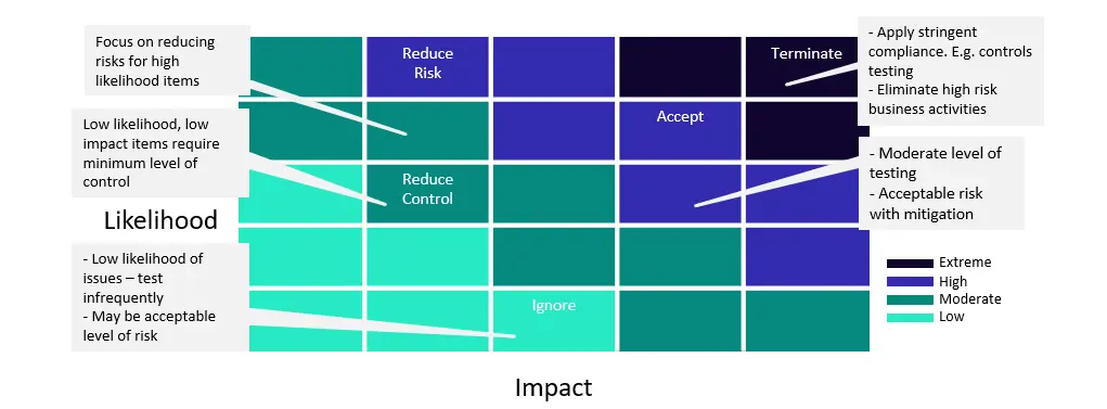
Figure 1: Risk Heat Map
How Does A Risk Heat Map Work?
A risk heat map works by translating raw risk assessment data into a visual layout that makes portfolio-level priorities immediately legible to any stakeholder, from operational risk owners to board members. The process moves through several connected stages that each depend on the quality of the inputs and the consistency of the criteria applied. A risk heat map usually includes the following steps:
Collecting and consolidating risk inputs; the heat map's accuracy depends entirely on the quality of the risk information fed into it. Inputs typically draw from risk assessment workshops, internal audit findings, incident and loss data, control testing results, and subject matter expertise from across the business. Organizations that rely on a centralized risk register as their source of record produce more consistent and defensible heat maps than those that aggregate inputs ad hoc.
Scoring likelihood and impact against shared criteria; each identified risk is scored on both dimensions using the scales and descriptors the organization has defined. Consistency at this stage is critical: when different teams apply the same scoring criteria, comparisons across the portfolio are meaningful. When they do not, the heat map creates a false impression of relative priority that can misdirect management attention.
Plotting risks and applying color zones; each risk is placed at the intersection of its likelihood and impact scores, and the cell it occupies determines its color zone. The color boundaries are set by the organization's risk appetite, not by generic thresholds, so that the visual immediately communicates whether a risk is within tolerance, requires active management, or demands escalation.
Reviewing, validating, and connecting to action; a heat map that is not reviewed and acted upon is a reporting artifact rather than a management tool. Once plotted, risk positions should be validated with risk owners and senior leadership to confirm the relative positioning reflects reality, and the map should be explicitly linked to resource allocation decisions, control investments, and escalation protocols so that it drives action rather than documents exposure.
Benefits of Using A Risk Heat Map
A risk heat map delivers value beyond the visual. Because it forces a structured, criteria-based assessment of every identified risk and presents the results in a format accessible to any stakeholder, it changes how risk conversations happen across the organization, from the operational level to the boardroom. The benefits span analytical, communicative, and strategic dimensions. Key benefits organizations realize from a well-maintained risk heat map include:
Enhanced Visualization of Complex Risk Profiles
These maps transform the daunting complexity of risk data into an accessible, color-coded matrix. This visualization lays bare the terrain of risks scattered across the organization, categorized by severity and likelihood. The clear demarcation of risk levels facilitates a deeper understanding among all organizational levels, making it immediately apparent which areas require urgent attention and which pose less of a threat.
Strengthened Communication with Stakeholders
When discussing risks, the abstract can swiftly become concrete through the use of these maps. They serve as a shared language among various stakeholders, transcending the barriers of technical jargon. Executives, board members, and operational teams can all converge on this common ground, fostering a unified understanding and approach to risk management. This collaborative approach is crucial for aligning risk mitigation efforts with organizational goals.
Facilitation of Proactive Risk Management
By highlighting potential high-impact risks before they manifest, organizations are afforded the precious commodity of time — time to strategize, time to allocate appropriate resources, and time to implement measures that can either prevent the occurrence of a risk or significantly mitigate its impact. This proactive approach helps preserve organizational resources and also safeguards against the potential derailment of business objectives.
Improved Risk Awareness Across the Organization
The visual and easy-to-understand nature of heat maps makes them accessible to employees at all levels, fostering a culture of risk awareness and responsibility. When everyone is aware of the potential risks and understands their impact, it fosters a collective effort towards risk mitigation. This widespread awareness is vital for ensuring that risk management becomes an integral part of the organizational culture, rather than being viewed as a separate or external process.
Enhanced Analytical Capabilities
The process of creating a risk heat map requires gathering, analysis, and synthesis of complex risk data. This exercise enhances the organization’s analytical capabilities as it involves evaluating risks from multiple dimensions, including likelihood, impact, and velocity. By engaging in this analytical process, organizations can uncover insights that might have been overlooked otherwise. These insights can then inform more strategic risk management approaches and contribute to a deeper understanding of the organization’s risk profile.
When To Use a Risk Heat Map
A risk heat map is not a tool for every occasion, but in the right contexts it provides a clarity and speed of communication that no other risk format matches. The following scenarios represent the situations where heat maps deliver the most value. Organizations benefit most from heat map analysis in the following situations: \
Strategic planning
When leaders set goals or consider new markets, a heat map shows which risks could block plans and where mitigation will matter most.
Project kickoffs and major initiatives
Before launching large programs, map risks to spot critical dependencies, resource needs, and controls that must be in place from day one.
Quarterly or annual risk reviews
Use the map to summarize changes across the organisation, show trending exposures, and guide which risks deserve deeper attention each cycle.
Incident reviews and root-cause analysis
After a breach or failure, plotting related risks helps reveal weak links, control gaps, and the true scope of impact.
Board and executive reporting
A visual heat map turns complex risk data into a conversation tool that helps boards quickly grasp priority areas and decide on resources.
Vendor and third-party risk assessments
When evaluating suppliers, heat maps help compare which providers introduce the most exposure and where contractual controls are needed.
Regulatory or compliance changes
If rules shift, use a heat map to see which processes or controls will be affected and to prioritise remediation work.
How To Create a Risk Heat Map
Building a reliable risk heat map requires more than plotting risks on a grid. The quality of the output depends on the rigor of the inputs, the consistency of the scoring criteria, and the discipline of the review process. The steps below outline a standard construction process applicable to organizations of any size or sector. The following steps outline the standard process for creating a risk heat map:
Identification of Risks:
The first step is to list all possible risks that can affect the organization. This stage requires thorough brainstorming and input from various departments to ensure no potential risk is overlooked.
Risk Assessment:
Each identified risk undergoes a comprehensive assessment to determine its likelihood of occurrence and the potential impact on the organization. These assessments are typically quantitative, assigning scores to both likelihood and impact on a predetermined scale.
Data Compilation:
The likelihood and impact scores gathered from risk assessments are pivotal data points. They are meticulously compiled and serve as the foundational input for populating the heat map.
Plotting on the Heat Map:
With the data in hand, each risk is plotted on the heat map according to its likelihood and impact scores. The axes of the heat map represent these two dimensions.
Visualization Through Colors:
The heat map uses a color gradient to represent the severity of risks. The most widely used gradient is the red, yellow, and green gradient, with green signifying low-priority risks, yellow indicating moderate-priority risks, and red highlighting high-priority or critical risks. Critical risks require immediate attention as they pose the most significant threat to the organization's objectives. This visual representation makes it intuitive to understand the risk landscape at a glance.
Develop Mitigation Strategies:
For the highest-priority risks, create detailed mitigation plans outlining specific actions to reduce the likelihood or impact of the risk. Assign responsibilities and set timelines for implementing these strategies.
Review and Update Regularly:
A risk heat map is a dynamic tool that should be reviewed and updated regularly. As new risks emerge and existing risks change, adjust the heat map accordingly to ensure it remains an accurate representation of the current risk landscape.
How GRC Platforms Support Risk Heat Map Management
A risk heat map is only as current and reliable as the data and processes that sit behind it. When heat maps are produced manually, whether in spreadsheets or presentation slides, they quickly become outdated, inconsistently scored, and disconnected from the controls and risk register data that should inform them. GRC platforms address these limitations by embedding the heat map within a governed, integrated risk management workflow. The capabilities that matter most span three areas:
Centralized risk data and live heat map generation; a GRC platform connects the heat map directly to the underlying risk register, so every risk's position on the map reflects the current assessment rather than a static snapshot from the last review cycle. When a risk owner updates a likelihood or impact score, the heat map updates automatically, eliminating the version control problems that arise when multiple teams maintain separate heat map files. All stakeholders, from operational risk owners to board members, work from a single, authoritative view of the portfolio.
Automated scoring consistency and threshold alerting; GRC platforms enforce the scoring criteria and zone boundaries that organizations define at the framework level, reducing the assessor subjectivity that is one of the most cited limitations of manual heat maps. Configurable threshold alerts notify risk owners and risk managers automatically when a risk score crosses a zone boundary, ensuring that escalation is systematic and timely rather than dependent on the next scheduled review cycle.
Executive reporting and drill-down capability; heat maps generated through a GRC platform can be filtered by business unit, risk category, geography, or regulatory framework, giving leadership the focused views they need for committee reporting without requiring manual reconstruction of the data. Drill-down functionality allows any stakeholder to move from a heat map cell directly to the full risk record, supporting informed discussion rather than surface-level review.
How MetricStream Can Help
Translating a risk heat map from a periodic reporting exercise into a continuously current, decision-grade risk management tool requires a platform that connects assessment data, risk register records, and executive reporting in a single governed environment. MetricStream's Enterprise Risk Management solution provides that foundation, offering dynamic heat map visualization that updates in real time as risk assessments are revised, controls are tested, and new risks are identified. Organizations can configure map dimensions, color zone boundaries, and risk appetite thresholds directly within the platform, ensuring the heat map reflects the organization's own risk tolerance rather than a generic scoring template.
Beyond visualization, MetricStream connects the heat map to the broader risk lifecycle. Risk owners receive automated alerts when scores cross zone thresholds, making escalation systematic rather than dependent on manual monitoring between review cycles. Separate inherent and residual risk views allow organizations to track how effectively controls are performing across the portfolio, giving risk committees and boards the evidence base they need to assess whether risk treatment is working.
For organizations reporting across multiple business units or regulatory frameworks, MetricStream's filtering and drill-down capabilities allow heat maps to be generated at the enterprise level or scoped to a specific function, geography, or risk category on demand.
A risk heat map (or risk heatmap) is a visual risk assessment tool that displays an organisation's risks on a color-coded grid, plotting each risk according to its likelihood of occurrence (on one axis) and the severity of its potential impact (on the other). Green cells indicate low risk, amber indicates moderate risk, and red indicates high risk. Risk heat maps give leadership an at-a-glance view of risk portfolio status and are widely used in board reporting and risk committee presentations.
Risk is not a background condition for modern organizations — it is an active, measurable force shaping strategic decisions at every level. Aon's 2025 Global Risk Management Survey, drawing on responses from nearly 3,000 risk managers, C-suite leaders, and executives across 63 countries, found that cyber attack, climate change, and geopolitical volatility now occupy the top ranks of global risk concern. The gap between risk awareness and risk measurement is precisely where tools like the risk heat map deliver the most value: by translating complex, multi-source risk data into a visual format that any stakeholder can read, act on, and communicate in minutes.
That’s why many choose a tool like MetricStream. Its platform gathers risk data from across the organisation and turns it into interactive heatmaps that highlight key exposures at a glance. Teams can see where risks cluster, what’s changing, and where to act first — helping them stay ahead, not just react.
With effective heatmaps, organisations avoid surprises and stay prepared. They make it easier for leaders to see risk at scale, talk about it clearly, and match resources to what matters most.
A risk heat map is one of the most widely used tools in enterprise risk management, but its value depends on how well it is built, maintained, and connected to decision-making. The points below summarize what it is, how it works, and what organizations need to get right to use it effectively. The following points summarize what a risk heat map is, how it works, and why it matters for risk-led organizations:
- A risk heat map is a visual tool that represents the likelihood and impact of various risks on a color-coded grid, helping organizations prioritize and manage potential threats effectively.
- Purpose of Risk Heat Maps: Visual tools to prioritize and manage risks based on their likelihood and impact.
- Creation Process: Identify and assess risks, assign scores for likelihood and impact, plot on a grid, use color-coding for severity, and develop mitigation strategies.
- Key Benefits: Enhanced visualization, improved stakeholder communication, proactive risk management, increased organizational risk awareness, and strengthened analytical capabilities.
- Importance of Regular Updates: Regular reviews and updates ensure the heat map remains an accurate and effective tool.
A risk heat map is a visual tool that organizes risks based on their likelihood and impact, allowing teams to understand exposure at a glance. It brings together data from assessments, controls, and incidents to present a clear view of where risks concentrate and which areas need attention. By translating risk levels into a simple color-coded grid, it helps leaders prioritise actions and make informed decisions.
The standard 5×5 heat map below illustrates how likelihood and impact scores combine to produce color-coded risk zones across 25 cells:
| Likelihood ↓ / Impact → | Negligible (1) | Minor (2) | Moderate (3) | Major (4) | Catastrophic (5) |
| Almost Certain (5) | 5 🟡 | 10 🟡 | 15 🔴 | 20 🔴 | 25 🔴 |
| Likely (4) | 4 🟢 | 8 🟡 | 12 🟡 | 16 🔴 | 20 🔴 |
| Possible (3) | 3 🟢 | 6 🟢 | 9 🟡 | 12 🟡 | 15 🔴 |
| Unlikely (2) | 2 🟢 | 4 🟢 | 6 🟢 | 8 🟡 | 10 🟡 |
| Rare (1) | 1 🟢 | 2 🟢 | 3 🟢 | 4 🟢 | 5 🟡 |
🟢 Low (1–6): Monitor routinely | 🟡 Medium (7–12): Manage actively | 🔴 High (13–25): Priority action required
Central to the effectiveness of a risk heat map are its two primary axes, one representing the likelihood or probability of a risk occurring, and the other showcasing the impact or severity of consequences should the risk materialize. This two-dimensional framework allows for a nuanced analysis of risks, categorizing them by both, their potential to happen, and also by the magnitude of their possible effects on the organization.
Adding a layer of intuitive understanding to this framework, color coding enhances the heat map’s accuracy.
Traditionally, this involves employing a color gradient – typically red, yellow, and green – to signify the severity of risks. Risks mapped in red zones are indicative of critical threats that demand immediate attention due to their high probability and significant impact.
Yellow, on the other hand, signals moderate risks that warrant caution but may not require urgent action. Green areas are associated with low-priority risks, either due to their low likelihood, minimal impact, or both.
This color-coded system simplifies complex risk assessments, allowing stakeholders to quickly grasp and navigate the situation.
Risk Heat Map Components
| Component | Description | Design Consideration |
| Y-Axis (Likelihood) | Represents the probability that each risk will occur within the assessment period | Use clearly defined descriptors at each level: Rare, Unlikely, Possible, Likely, Almost Certain — with criteria specifying what each level means in organizational context |
| X-Axis (Impact) | Represents the severity of consequences if the risk materializes | Define impact separately across financial, operational, compliance, and reputational dimensions to prevent assessors from conflating different consequence types |
| Color Zones | Visual classification of risk severity across the grid | Calibrate zone boundaries to the organization's risk appetite rather than applying generic thresholds; what is red for one organization may be amber for another with a higher risk tolerance |
| Risk Points | Individual risks plotted at their likelihood-impact intersection | Display a risk ID and brief name at each point; each point should link through to the full risk register entry for drill-down context |
| Legend | Defines what each color zone means and what action is required | Always include; specify not just the color label but the expected management response for each zone so the map is self-explanatory to any reader |
| Risk Trajectory Arrows | Directional indicators showing whether each risk is increasing, decreasing, or stable since the last review | Include where the platform supports it; trajectories add significant analytical value by showing momentum, not just current position |
Figure 1: Risk Heat Map
A risk heat map works by translating raw risk assessment data into a visual layout that makes portfolio-level priorities immediately legible to any stakeholder, from operational risk owners to board members. The process moves through several connected stages that each depend on the quality of the inputs and the consistency of the criteria applied. A risk heat map usually includes the following steps:
Collecting and consolidating risk inputs; the heat map's accuracy depends entirely on the quality of the risk information fed into it. Inputs typically draw from risk assessment workshops, internal audit findings, incident and loss data, control testing results, and subject matter expertise from across the business. Organizations that rely on a centralized risk register as their source of record produce more consistent and defensible heat maps than those that aggregate inputs ad hoc.
Scoring likelihood and impact against shared criteria; each identified risk is scored on both dimensions using the scales and descriptors the organization has defined. Consistency at this stage is critical: when different teams apply the same scoring criteria, comparisons across the portfolio are meaningful. When they do not, the heat map creates a false impression of relative priority that can misdirect management attention.
Plotting risks and applying color zones; each risk is placed at the intersection of its likelihood and impact scores, and the cell it occupies determines its color zone. The color boundaries are set by the organization's risk appetite, not by generic thresholds, so that the visual immediately communicates whether a risk is within tolerance, requires active management, or demands escalation.
Reviewing, validating, and connecting to action; a heat map that is not reviewed and acted upon is a reporting artifact rather than a management tool. Once plotted, risk positions should be validated with risk owners and senior leadership to confirm the relative positioning reflects reality, and the map should be explicitly linked to resource allocation decisions, control investments, and escalation protocols so that it drives action rather than documents exposure.
A risk heat map delivers value beyond the visual. Because it forces a structured, criteria-based assessment of every identified risk and presents the results in a format accessible to any stakeholder, it changes how risk conversations happen across the organization, from the operational level to the boardroom. The benefits span analytical, communicative, and strategic dimensions. Key benefits organizations realize from a well-maintained risk heat map include:
Enhanced Visualization of Complex Risk Profiles
These maps transform the daunting complexity of risk data into an accessible, color-coded matrix. This visualization lays bare the terrain of risks scattered across the organization, categorized by severity and likelihood. The clear demarcation of risk levels facilitates a deeper understanding among all organizational levels, making it immediately apparent which areas require urgent attention and which pose less of a threat.
Strengthened Communication with Stakeholders
When discussing risks, the abstract can swiftly become concrete through the use of these maps. They serve as a shared language among various stakeholders, transcending the barriers of technical jargon. Executives, board members, and operational teams can all converge on this common ground, fostering a unified understanding and approach to risk management. This collaborative approach is crucial for aligning risk mitigation efforts with organizational goals.
Facilitation of Proactive Risk Management
By highlighting potential high-impact risks before they manifest, organizations are afforded the precious commodity of time — time to strategize, time to allocate appropriate resources, and time to implement measures that can either prevent the occurrence of a risk or significantly mitigate its impact. This proactive approach helps preserve organizational resources and also safeguards against the potential derailment of business objectives.
Improved Risk Awareness Across the Organization
The visual and easy-to-understand nature of heat maps makes them accessible to employees at all levels, fostering a culture of risk awareness and responsibility. When everyone is aware of the potential risks and understands their impact, it fosters a collective effort towards risk mitigation. This widespread awareness is vital for ensuring that risk management becomes an integral part of the organizational culture, rather than being viewed as a separate or external process.
Enhanced Analytical Capabilities
The process of creating a risk heat map requires gathering, analysis, and synthesis of complex risk data. This exercise enhances the organization’s analytical capabilities as it involves evaluating risks from multiple dimensions, including likelihood, impact, and velocity. By engaging in this analytical process, organizations can uncover insights that might have been overlooked otherwise. These insights can then inform more strategic risk management approaches and contribute to a deeper understanding of the organization’s risk profile.
A risk heat map is not a tool for every occasion, but in the right contexts it provides a clarity and speed of communication that no other risk format matches. The following scenarios represent the situations where heat maps deliver the most value. Organizations benefit most from heat map analysis in the following situations: \
Strategic planning
When leaders set goals or consider new markets, a heat map shows which risks could block plans and where mitigation will matter most.
Project kickoffs and major initiatives
Before launching large programs, map risks to spot critical dependencies, resource needs, and controls that must be in place from day one.
Quarterly or annual risk reviews
Use the map to summarize changes across the organisation, show trending exposures, and guide which risks deserve deeper attention each cycle.
Incident reviews and root-cause analysis
After a breach or failure, plotting related risks helps reveal weak links, control gaps, and the true scope of impact.
Board and executive reporting
A visual heat map turns complex risk data into a conversation tool that helps boards quickly grasp priority areas and decide on resources.
Vendor and third-party risk assessments
When evaluating suppliers, heat maps help compare which providers introduce the most exposure and where contractual controls are needed.
Regulatory or compliance changes
If rules shift, use a heat map to see which processes or controls will be affected and to prioritise remediation work.
Building a reliable risk heat map requires more than plotting risks on a grid. The quality of the output depends on the rigor of the inputs, the consistency of the scoring criteria, and the discipline of the review process. The steps below outline a standard construction process applicable to organizations of any size or sector. The following steps outline the standard process for creating a risk heat map:
Identification of Risks:
The first step is to list all possible risks that can affect the organization. This stage requires thorough brainstorming and input from various departments to ensure no potential risk is overlooked.
Risk Assessment:
Each identified risk undergoes a comprehensive assessment to determine its likelihood of occurrence and the potential impact on the organization. These assessments are typically quantitative, assigning scores to both likelihood and impact on a predetermined scale.
Data Compilation:
The likelihood and impact scores gathered from risk assessments are pivotal data points. They are meticulously compiled and serve as the foundational input for populating the heat map.
Plotting on the Heat Map:
With the data in hand, each risk is plotted on the heat map according to its likelihood and impact scores. The axes of the heat map represent these two dimensions.
Visualization Through Colors:
The heat map uses a color gradient to represent the severity of risks. The most widely used gradient is the red, yellow, and green gradient, with green signifying low-priority risks, yellow indicating moderate-priority risks, and red highlighting high-priority or critical risks. Critical risks require immediate attention as they pose the most significant threat to the organization's objectives. This visual representation makes it intuitive to understand the risk landscape at a glance.
Develop Mitigation Strategies:
For the highest-priority risks, create detailed mitigation plans outlining specific actions to reduce the likelihood or impact of the risk. Assign responsibilities and set timelines for implementing these strategies.
Review and Update Regularly:
A risk heat map is a dynamic tool that should be reviewed and updated regularly. As new risks emerge and existing risks change, adjust the heat map accordingly to ensure it remains an accurate representation of the current risk landscape.
How GRC Platforms Support Risk Heat Map Management
A risk heat map is only as current and reliable as the data and processes that sit behind it. When heat maps are produced manually, whether in spreadsheets or presentation slides, they quickly become outdated, inconsistently scored, and disconnected from the controls and risk register data that should inform them. GRC platforms address these limitations by embedding the heat map within a governed, integrated risk management workflow. The capabilities that matter most span three areas:
Centralized risk data and live heat map generation; a GRC platform connects the heat map directly to the underlying risk register, so every risk's position on the map reflects the current assessment rather than a static snapshot from the last review cycle. When a risk owner updates a likelihood or impact score, the heat map updates automatically, eliminating the version control problems that arise when multiple teams maintain separate heat map files. All stakeholders, from operational risk owners to board members, work from a single, authoritative view of the portfolio.
Automated scoring consistency and threshold alerting; GRC platforms enforce the scoring criteria and zone boundaries that organizations define at the framework level, reducing the assessor subjectivity that is one of the most cited limitations of manual heat maps. Configurable threshold alerts notify risk owners and risk managers automatically when a risk score crosses a zone boundary, ensuring that escalation is systematic and timely rather than dependent on the next scheduled review cycle.
Executive reporting and drill-down capability; heat maps generated through a GRC platform can be filtered by business unit, risk category, geography, or regulatory framework, giving leadership the focused views they need for committee reporting without requiring manual reconstruction of the data. Drill-down functionality allows any stakeholder to move from a heat map cell directly to the full risk record, supporting informed discussion rather than surface-level review.
Translating a risk heat map from a periodic reporting exercise into a continuously current, decision-grade risk management tool requires a platform that connects assessment data, risk register records, and executive reporting in a single governed environment. MetricStream's Enterprise Risk Management solution provides that foundation, offering dynamic heat map visualization that updates in real time as risk assessments are revised, controls are tested, and new risks are identified. Organizations can configure map dimensions, color zone boundaries, and risk appetite thresholds directly within the platform, ensuring the heat map reflects the organization's own risk tolerance rather than a generic scoring template.
Beyond visualization, MetricStream connects the heat map to the broader risk lifecycle. Risk owners receive automated alerts when scores cross zone thresholds, making escalation systematic rather than dependent on manual monitoring between review cycles. Separate inherent and residual risk views allow organizations to track how effectively controls are performing across the portfolio, giving risk committees and boards the evidence base they need to assess whether risk treatment is working.
For organizations reporting across multiple business units or regulatory frameworks, MetricStream's filtering and drill-down capabilities allow heat maps to be generated at the enterprise level or scoped to a specific function, geography, or risk category on demand.
Frequently Asked Questions
A risk heat map is a color-coded grid that plots an organization's risks by likelihood and potential impact, giving boards, risk committees, and senior leadership an at-a-glance view of which risks require priority attention and which can be monitored routinely.
The terms are often used interchangeably, but in practice "risk matrix" tends to describe the scoring methodology and template construction, while "risk heat map" emphasizes the visual communication function of displaying the populated risk portfolio to leadership.
A standard risk heat map comprises a likelihood axis, an impact axis, color-coded risk zones, risk points plotted at their likelihood-impact intersection, a defining legend, and optional trajectory arrows indicating whether each risk is increasing or stabilizing.
Creating a risk heat map involves identifying risks, scoring each for likelihood and impact against agreed criteria, selecting a matrix size, plotting each risk at its likelihood-impact intersection, and validating the resulting map with risk owners and senior leadership.
Risk heat maps are subject to assessor subjectivity, oversimplification of interconnected risks, static snapshots, anchoring bias that preserves initial placements across review cycles, and false precision, meaning they should supplement rather than replace more rigorous risk analysis.
A risk heat map should be reviewed at least quarterly, with full annual reassessment and event-triggered updates whenever a significant new risk emerges, a control fails, or a material business or external change alters the risk landscape.
Inherent risk reflects a position on the heat map before controls are applied, while residual risk reflects the position after controls are in place, and plotting both with a connecting arrow illustrates the risk reduction controls are delivering.
Color coding should be calibrated to the organization's risk appetite rather than applied generically, with red indicating risks that exceed tolerance and require immediate treatment, amber indicating risks requiring active monitoring, and green indicating risks within acceptable thresholds.
Risk heat maps are widely used for cyber risk visualization, with likelihood scored against threat intelligence and vulnerability data, and impact assessed across data loss, system availability, regulatory exposure, and reputational damage, often maintained as a dedicated map.
MetricStream's Enterprise Risk Management platform provides real-time heat map visualization connected to the underlying risk register, supporting configurable map sizes, separate inherent and residual views, risk appetite-aligned color zones, and automated alerts when risks breach defined thresholds.
A risk heat map is a color-coded grid that plots an organization's risks by likelihood and potential impact, giving boards, risk committees, and senior leadership an at-a-glance view of which risks require priority attention and which can be monitored routinely.
The terms are often used interchangeably, but in practice "risk matrix" tends to describe the scoring methodology and template construction, while "risk heat map" emphasizes the visual communication function of displaying the populated risk portfolio to leadership.